BRIEF –
Collar City Auto Haus – a unique auto shop specializing in installing high-end turbochargers – was looking for a brand that would appeal to serious car lovers. The client’s goal was a simple and contemporary logo with the use of their name and product displayed in a subtle way.
FINAL LOGO –
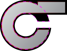
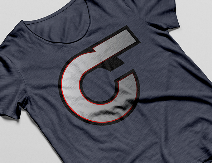
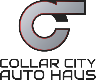
The main symbol mimics the shape of a turbocharger while the two “C”s stand for Collar City. A silver was chosen for the main color while a hint of fire red gives it an added dimension.
Turbocharger

Turbocharger
“C” for Collar

“C” for Collar
“C” for City
“C” for City
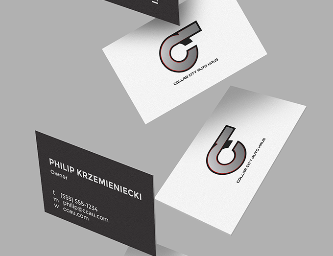


DIGITAL


LOGO EXPLOITATION -
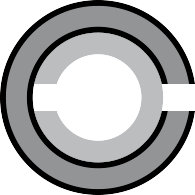
Before deciding on the final logo and wordmark, we went through three rounds of exploration. A few of them are seen below.







LOGO EXPLOITATION -
Before deciding on the final logo and wordmark, we went through three rounds of exploration. A few of them are seen below.


WALLPAPER -
In addition to the primary logo, I created a secondary mark that could be used as a wallpaper background. The entire acronym CCAH is displayed. The 2 “C”s are the brackets on the end, one forward and one backwards. The “A” and “H” are seen in the negative space.
